Showing posts with label Audience Feedback. Show all posts

Tuesday, 15 March 2011

A level Media Show Case Questionnaires Results 2

Originally, these images were on a slide share PowerPoint, but the upload failed multiple times. Please click on image to enlarge (recommended)

A level Media Show Case Questionnaires Results 1

(Click on images to enlarge)
As you can see from the graph, the majority of feedback was positive and we succeeded in including a variety of shots, please our audience (who were of the desired demographic) and create a music video that was logical in its narrative.
For question 3, the majority answered "No" meaning that the balance of narrative and performance was just right. For more comments, refer to the second results post.

Thursday, 17 February 2011

A level Media Show Case

Today there will be a Show Case of all A level student's media coursework for this year. The subsidiary tasks will be displayed on boards for the audience to view before the showing of music videos. To gather user feedback, a questionnaire was typed up to hand out to members of the audience. The questionnaire is designed to see if we have successfully conformed to music video conventions and create an enjoyable video that has "quirky" atmosphere we have strived for through out production.

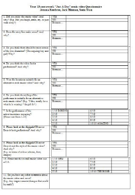
Below is an image of the questionnaire itself. (Click to enlarge)


The questions typed up (if image fails to enlarge):


1. Did you enjoy the music video? And why? (E.g. Did you laugh, smile, cry, or just walk away?)
2. Does the story line make sense? And why?
3. Do you think there should be more scenes of the two characters? (The arguing boy and girl) Why?
4. Do you think the video looks professional? And why?
5. Were the locations suitable for an alternative-rock music video? And why?
6. Do you think the styling of the performers is suitable for an alternative-rock music video? 7. Is the performance of the actors/musicians engaging?
(Please rate from 1-10)
8. Please look at the digipak/CD cover
Does it look professional? And why?
9. Please look at the digipak/CD cover
Does it suit the style of the music video? And why?
(E.g. in terms of colour scheme, font, images)
10. Please rate the overall music video out of 10.
11. Do you have any other comments about the music video and cover?
(E.g. Any improvements/changes that could be made?)

Thursday, 20 January 2011

Magazine Advert: Audience Feedback

From class mates and teachers, they have said that the final version of the magazine advert testing (first one on development post 2) was the most similar to the digipak and also most vibrant in colour. Therefore, we will continue to develop this design and add copyright logos, website addresses, and an "OUT NOW" - Refer to "What a Magazine Advert Need".

Thursday, 18 November 2010

Audience Feedback From Classmates

Unfortunately, all the comments given to us about our almost-final music video was not written down or recorded in any form, so I'll paraphrase.

  • The Majority thought it was enjoyable, and the range of clips were good.
  • Saturation on the green screen needed to be toned down, at times the people looked pink
  • Some clips needed to be lip-synced better
  • The last few clips with the "Do do do do" was a very good way to end the music video
  • The opening was of Jack climbing down the clip was WAY too long
  • Female singer for a song sang by a male was confusing - to make it clear that the video was a somewhat tribute video, show clips of each band setting up in the beginning to establish they they are not the original artists (some music videos do do this, such as the original Feeder video which features fans only, never the actual members of feeder)

We will finish off our music video by following this feedback.