Wednesday, 8 December 2010
Tuesday, 30 November 2010
Magazine Advert Research: Music magazines
 Damien Rice Album Advert
 - The drawing is complicated, and its use of swirls connotes the style of music this artist may have (E.g. Contemporary Indie). It also has doodled of street lamps and cars, suggesting that the music speaks of 20th century life style.
- Due to the magazine adverts pastel colours, it is clear to the audience that it is not of the pop, R'n'B or Rock genre.
- The scratchy small case text for the artist's name also connotes the informal style of the artist himself. This is also portrayed by the beige back ground.
- This advert conforms to magazine advert conventions as there is a single, striking image in the centre of the page. It also has the basic information such as date of release, and brief info in track listing.
- This advert could be inspirational for our own advert, due to its simplistic but eye catching design and handwriting-like font.
 Howling Bells Radio Wars New Album Advert
 - This one is most relevant as inspiration for our magazine advert design as it is relatable to our digipak in terms of format. The four block colours/images of the band members shows the audience who they are, and what they represent through the connotations of the colours.
- The black background could also be used on our magazine cover, as it creates an attractive and striking contrast to the bold colours present in our digipak.
- It follows conventions as the name of the band and the album they're promoting is in large and bold font.
- It includes important information such as date, but also tells the reader that it is available on download. Fans of the band, or even people who know the singles can relate to this album as they have stated their singles "Chaos" and "Cities Burning Down" is included in the album, therefore creating an incentive for people to buy it.
- Website of their site and label's site is also shown.
 Stephen Malkmus and The Jicks
 - Unlike the other examples, this advert shows the cover of the actual product it is advertising, to create awareness and make it easier for people who want to identify it online. This is an important element that could be used on our "Just A Day" advert.
- This advert also uses a drawing as opposed to an image of the band members, which goes against conventions as an advert is meant to promote the product s well as the artist. However, in this design it includes random images which may be representative of the band and its past CD designs.
- There is a clear link between the magazine advert and the CD, from the drawing of the swirl, which is on the cover of the CD and within the dustbin drawing.
What does a Magazine Advert need?
Magazine Advert Research: Google

- Includes quotes/recommendations from other music magazines
- States song writer Ian Brown and original producer John Leckie
- Makes note of special tracks present, to appeal to past fans and those who know of the songs from the charts - creates awareness and appeal.
- Website
- Bottom corners - logos of stores that this CD is available at
- Image - may be relevant to the CD cover from the past, or its there because it just looks cool? Against black background, the colours appear more vibrant.
- Red, white, and blue font against black is striking.
 Ok Go New Album Advert and Article from Billboard Magazine
 - Font and block colours co-ordinate with the clothing that the band is wearing
- The image has no sense of proportion (it looks like they're coming out of the page) and therefore makes the image more interesting artistically.
- The people in the image fill up the page; to advertise themselves to fans and the public.
- There is a persuasive element - "BUY YOUR COPY NOW". The word "NOW" is an imperative, and therefore sounds more commanding towards the audience and is more impressionable.
 Feeder "Comfort in Sound" Album Magazine Advert
 - Takes up a whole magazine page.
- The white background makes it eye catching, as the text and images is less crowded than others.
- Follows conventions by having the album name, band, and 'Out Now' as the first three most noticeable information - it is in bold, black capitals.
- Goes against conventions, as there is not an image of the band itself. The drawing also seems irrelevant, and its meaning/symbolism may only be recognisable to fans.
- Format of the poster is very plain - all text is located on the left side and in the same font (besides the band name).
- It includes track listings - unusual as most magazine adverts has a large focusing image.

Gwen Stefani "Love, Angel, Music, Baby" Album Magazine Advert
- Main image is the same as the image on the CD, however it is still shown on the bottom left corner - this is helpful for people who have seen the advert, and want to look for it later.
- The artist's name is bigger than the album name.
- This advert may be restricted in terms of where it can be displayed - only in magazines where the demographics is over 17?
- Famous tracks such as "What you waitin' for?" and "Rich Girl" are stated on the advert
- Yellow over white symbolises the 50s, glamourous image the artists is trying to portray, but it makes the text difficult to read.
Friday, 26 November 2010
Digipak: Creation of Inside Sleeves - Exclusive Pics


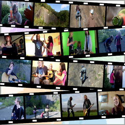
 To mimic film tape, Jemma then made a film-tape template using the shapes and lines controls, and transferred the images there. For the background, the final digipak cover images of the band members were put onto a separate layer in the project, and brightness levels turned down. The layer was put behind the film tape effect and the images, creating the above. I prefer this collage as it suits the house style of the digipak through its colour scheme, and the film tape relates to the "behind-the-scene" footage.
To define the images more, the brightness of the background image for the above collage was put up, and contrast lowered. This one is clearer to look out, however it may be too simple.

Working along the idea of tape, a similar style to the film tape background was done but with hazard tape. This is an interesting image because hazard tape connotes something dangerous, or even reckless, which can represent our "Just A Day" lyrics and narration.
We left these ideas for now, however as a group we have agreed that the film tape one it the most pleasant to look at and fits the rest of the digipak best.
Digipak: Creation of Inside sleeves - Lyrics page
 However, we felt that the image (above) looked too "primary", and "simple". So we lessened the contrast on the grain background, and thickened the blue lines. The actual lyrics were placed inside the lines, as opposed to just over it like before, and the font was changed. Photo shop had a limited amount of handwriting font styles, so we entered "marker", "hand writing" and "doodle" into Da Fonts search bar. This way, we were able to test a variety of font styles, and choose which one was most appropriate for the overall theme of our music video. This also enabled us to successfully convey our house style. Below shows the developed lyrics page, with new font.
  There needed to be another element that linked the lyrics page to the digipak. So doodles were done over the lyrics page. We made sure the doodles weren't "girly" (I did these - it was weird because unconsciously you felt the need to doodle stars... which is quite feminine). Some of the drawings relate to the music video, and some are just random.
  The image below has lowered saturation and the doodles are made lighter. We did this because the text, with the doodles seemed to be unnoticeable. Which was a disadvantage to the doodles, considering the main aspect of this side of the digipak was the lyrics.
  After comparing the lyrics page to the digipak front and back, we discovered that they did not co-ordinate at all. The font (which we later used for the digipak cover) matched, but it was light in colour scheme. Therefore, Jemma brilliantly inverted the colours, to create these!! (Look below!) By inverting the colours to red and black, it matched the house style of the front and back digipak covers, but was also a striking image in its own right.
 After some brief user feedback from our very reliable classmates, we found that the doodles crowded the page and made the lyrics harder to read. So the doodle layer on photo shop was removed, and new doodles were done. These were more relevant, and added the "fun-quirky" theme we wanted to convey, without removing the focus on the lyrics.
Digipak: Creation of Back Cover
 This image shows the lay out of the back cover would be like. The yellow image is from the front cover, showing how the same effect needs to be translated to the others.
  Whilst mixing colour channels and saturation levels, we managed to create a similar effect, once the "cut-out" filter was placed over the image. But, no matter how many times we did this, they result would be the same; the shadows on the face blended with the background, creating a flat silhouette. This was troublesome, as it hid the identity of our band member and did not co-ordinate with the other images. Even though we figured out how to do the same effect eventually, the yellow image, due to the un-preferable lighting of the original, always turned out with a person without a face.
Therefore, we decided to draw on the facial features uses the pen on photo shop. We are already behind schedule and this was the quickest way, although unprofessional.
 The above image shows the final four images that will be used for the back cover, with instruments.
We also made sure that for the back cover, we would have the copyright logo, barcoade, and DVD logo to conform to conventions of real life products, as well as other factors such as songwriter and producer creditations. 


 (The image below was taken from google and used for the logo above)
 Digipak: Creation of Front cover 2

However, after looking at the above testers, I felt the image did not look professional enough, in terms of spacing of texts and boxes. Therefore, the below image was made. Although the images are smaller, the area of black around the images frames it more, and is relevant to the research done on other digipaks. There is more emphasis on the font, and overall it is more aesthetically pleasing. 


The saturation of the images were made higher, giving contrast to the over all, and therefore creating a more striking image. Many fonts were also tested out. While changing he saturation of the images, we made sure the colours and tones used suited our target audience, and therefore were no too feminine or dark.
Digipak: Creation of Front cover 1


Wednesday, 24 November 2010
Filming: Digipak Photo Shoot


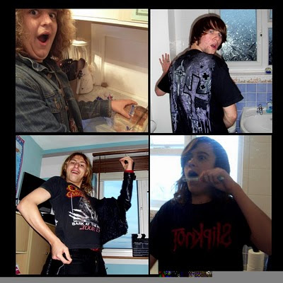
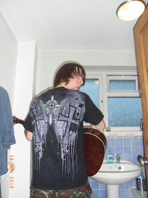
(Note: we thought it would be fun to do something a little risque and have a toilet/bathroom scene!


