As stated from the "What a Digipak needs" list, we would include a side with exclusive images of the band members and screen shots of the behind-the-scenes footage which would be an extra on the DVD. Jemma took screen grabs of our original footage to act as behind-the-scene images, cropped them, and copied them into photo shop. By putting each image on a different layer, we were able to place images on top of each other like a mood board. The following pictures display the range of ways to present the exclusive images side on our digipak.

The first was a simple mood board of images. This format is creative, and a different format to just a lay out of images as some overlap. From a glance, it conveys a light, care free feeling as it displays a variety of shots of the band members and crew having fun. However, it may be too crowded and distracts the customer from the actual images.

This one fits into our house style as there is a black background on the front and back of our digipak. The high-saturated images also fits the colour scheme of bright colours on the digipak cover. We also plan to use a bright colour scheme in the magazine poster, for continuity.

The same one was made with a white background, to compare and contrast. Although it is a lot simpler to look at and less crowded, this image would not look very professional, and at the same time it does not have enough editing in it for us as media students to hit points in the area of technology usage.

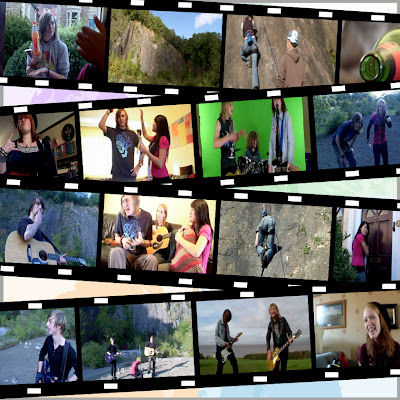
 To mimic film tape, Jemma then made a film-tape template using the shapes and lines controls, and transferred the images there. For the background, the final digipak cover images of the band members were put onto a separate layer in the project, and brightness levels turned down. The layer was put behind the film tape effect and the images, creating the above. I prefer this collage as it suits the house style of the digipak through its colour scheme, and the film tape relates to the "behind-the-scene" footage.


Therefore, this page with a white background and doodles was done. It is meant to complement the original lyrics page, with similar doodles. It is fun, quirky, and could be more appealing to fans of the band if we marketed the product by saying the doodles were done by the band members themselves. However, the overall aesthetic of this image may look too young, and therefore does not suit the age of our demographic and target audience (male 16-36, interested in pop-rock to metal, and interested in gaming, with a tailored sense of humour). Although, it could be argued that our audience would like this style, as there are game references; pac man ghosts.
 To mimic film tape, Jemma then made a film-tape template using the shapes and lines controls, and transferred the images there. For the background, the final digipak cover images of the band members were put onto a separate layer in the project, and brightness levels turned down. The layer was put behind the film tape effect and the images, creating the above. I prefer this collage as it suits the house style of the digipak through its colour scheme, and the film tape relates to the "behind-the-scene" footage.
To define the images more, the brightness of the background image for the above collage was put up, and contrast lowered. This one is clearer to look out, however it may be too simple.

Working along the idea of tape, a similar style to the film tape background was done but with hazard tape. This is an interesting image because hazard tape connotes something dangerous, or even reckless, which can represent our "Just A Day" lyrics and narration.
We left these ideas for now, however as a group we have agreed that the film tape one it the most pleasant to look at and fits the rest of the digipak best.
No comments:
Post a Comment