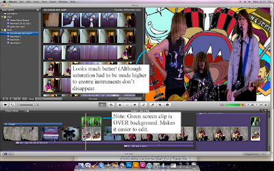
As with transferring any clip to the timeline, the same is done to the green screen clips on iMovie. However, afterwards, if the background is an image it must be dragged and dropped over the green screen clip. Then, a box should appear with a list of actions, one of which is 'Green screen'. Click onto that, and the background should automatically fit itself above the green screen clip. If the background clip lasts longer than the green screen clip itself, we cut the edges of it to fit perfectly.
But, because our background as a video (the graffiti wall and the sea scape), we had to drop the background video into the timeline first, and then put the green screen footage on. After doing this, we found that the beach background looked like a tacky 80s video. The instruments, unexpectedly were also very shiny, which meant it reflected off the green screen, so when a background was placed over it, the reflective part of the drum kit would blend into the background. Thinner things such as hair would also disappear at times is the head was moving (moshing!), this included fine details on the instruments as well, or anything that was similar to the colour green - this only occurred with Alex's yellow-ish guitar, we made sure before green screen filming that no one was allowed to wear green.
(Click image to enlarge)
 To improve the quality of the green screen we tried several solutions. We used other images, such as background test shots, but they seemed to remove other parts of our video footage (e.g. at one point some one's body disappeared into the background). Although plain backgrounds of white and green gave the best quality clip, we found they were too boring and defeated the point of having a green screen.
However, it was from this initial idea that we came up with the best solution. At time Jemma was editing the green screen, I was doodling ideas for digipak and magazine posters. For the sake of continuity, it was suggested that the drawing we were planning to use for our magazine poster should be scanned, coloured of photo shop, and used as the background for the green screen footage. The drawing itself was very caricatured, and with a bright, funky colour palette it could portray the quirky Ok Go music video vibes we were aiming for. This background would be linked to the Battery Point clips which had a graffiti background, but also provide a different change to real locations, hence giving us a variety. The main benefit of using the same drawing was also the fact that it would give a clear link between our music video and poster. (Pictures ARE worth a thousand words!)

No comments:
Post a Comment